As a social media user have you ever wondered which platform is the most used and why? For me it is instagram- a domain where visual supremacy meets the engaging writing styles i.e the right typography.
From a famous instagram page to a non famous one everybody wants their content to be engaging and attract their target audience. To achieve this you need to deliver the audience high quality services and goods but also amazing and creative instagram content. To make the content pop up attractive templates and fonts are used to make the post engaging. The appropriate choice of font ensures that the message delivered is understood and has a scroll stopping impact.
So today we are going to reveal the secrets of instagram fonts. No matter you are dealing with a page that acts as your brand identity or maintains the personal space authenticity, instagram fonts will help you create and design your story. This blog will take you through 10 best instagram fonts.
-
- Didot
- Cormorant Garamond
- Creative Vintage
- Emerland
- Meritta Serif
- Open Sans
- Raleway
- Monerd
- Montserrat
- Etapi Sans
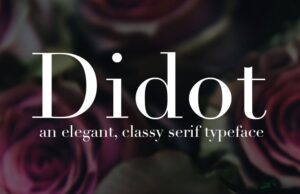
1. Didot
You can experience a clear and exciting reading experience specifically with the legibility of text copy when dealing with Didot Serif font. It is a sophisticated and elegant choice. In addition the bold vertical strokes are the attention grabbers. Didot is commonly used by high end brands that are ready to create time less stories.
High contrast strokes enhancing the readability are the key feature of the Didot font. Thus it works very efficiently when used in story posts as it attracts quick attention and effectively delivers the message.
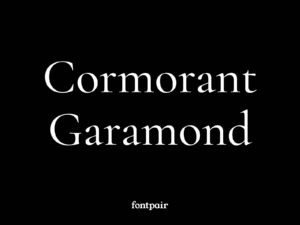
2. Cormorant Garamond
Carmorant Garamond fond is a versatile, fanciful and eye catching display serif font. It is a easy to read style that very efficiently balance the traditional and contemporary styles.
This font is usually preferred in posts where you need to create authority, or trust building stories. Carmorent is one of the best fonts for educational or informative static image posts or reels.
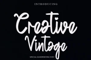
3. Creative Vintage
Creative vintage is the font of choice when the posts required an antique touch. When dealing with posts where writing is the epicenter specially its bold chunky strokes. It has a modern serif and vintage charm which gives it a retro yet modern charm. Creative vintage works fast using add on features, like adding a “+” and you can get an alternate instantly.
Having a traditional mood and a traditional style is one thing but the curvy stroke brings in a playful twist. SO this is the font of choice when you have to create a quirky yet vintage post for static images or reels.
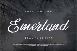
4. Emerland
The emerland font is a contemporary, elegant and classy serif font that leaves behind an impactful presence about sophistication and modernity. It works with a mix of tradition and professionalism. The key feature is its heavy strokes, which make it a font of choice for lifestyle brands that works to create a statement design.
It has a good readability, as it has moderate contrast in its strokes, which makes it comfortable to read even in smaller size. This feature makes it one of the best social media specially instagram font style, as they are easily accessible through small screens like smart phones and tabs. When working with the bold style emerland is the greatest for title text in carousel post or even the hero text when working with static images.
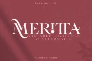
5. Merritta Serif
Almost all of the fonts have a specific structure associated with them, but when in need of something more innovative and creative, with a particular charm and the serif font luxury then the Meritta Serif is the best available option. It is a multi- purpose font, inspired by classic letters, designers created it with a combination of lattices and embedded swirls. Meritta serif is sure to impress your target audiences when used for intended purposes.
It is a popular option for luxury brands, for posting invitations on social media or product launch announcements in reels and posts. Its slightly irregular character sizes and elaborate swashes deteriorate the readability of the font specifically when scaled down. So, it is better to restrict this font style to the title text (in order to grab attention).
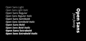
6. Open Sans
Open Sans is a modern sans serif font designed by Steve Matteson. It is excellent for most of the uses. It has an amazing readability when dealing in small sizes and when printed in huge size the readability remains intact.
The font is slim and has a curvy stroke that makes it friendly to use but keeping the professionalism alive. The versatility and clarity of the font makes it perfect for Instagram. Open Sans can be used for multiple purposes like posting speedy business updates or an engaging informative post. Thus influencers and small business owners prefer to use it for text in reels.
7. Raleway
Raleway is a graceful sans-serif typeface. It is a font that displays discretionary and standard ligatures, a set of diacritics, old style and lining numerals, as well as a geometric sans-serif inspired stylish alternate. It looks a lot like Open Sans, yet some very prominent differences like the W in the image thus bringing in innovation and creativity. Brands working to create modern aesthetics use this font for their content.
Raleway has an even stroke and is slim which makes it readable irrespective of screen or font size. It is used when attempting to design a simple theme for carousels or Story posts.
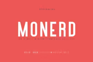
8. Monerd
Monerd is a font of choice for lifestyle brands working to develop discerning designs. As it comes with tall and slim letters, their uppercase is a prominent choice for techno brands.
Monerd is the font of choice for headings. For longer lines of text or sub heading, it works efficient on boosting the kerning to improve readability. When talking about font placement monerd is fine in static images, reels and stories. Monerd can be customized according to your brand suitability, by changing the kerning and using the appropriate font formatting.
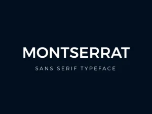
9. Montserrat
Montserrat is an essential component of contemporary aesthetics. It has a close resemblance with Open Sans. It has slimmer yet slightly broader strokes giving it a unique look. The geometric characteristic of the font makes it readable irrespective of font size and the length of the next one. Keeping the story short when considering readability as the prior factor like in carousels or informative posts, Montserrat performs its duty efficiently.
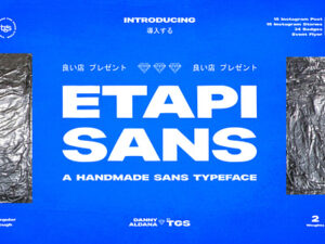
10. Etapi Sans
Etapi Sans has a small rounded character and broad bold strokes. It is an attractive and unique font that is used for creating huge headlines for social media advertisement, or scroll stopping minimal text containing stories. Scaling down of the font effects its readability of the text, thus it is not the font of choice for the body text. Etapi Sans has a clean cutting edge making it fit for contemporary brands and the one targeting the youth as an audience.
CONCLUSION
I hope you thoroughly reading the blog, as much as I enjoyed writing it. The world of fonts is huge and selection of the right font is an art, so you have to be very careful while selecting one. It is a crucial decision as it can uplift the mood and message of your content. Any post on social media will go unnoticed if it doesn’t cater the right emotional response. Find the right fonts and correct formatting may bring in the win-win situation. And if you are truly ready to step up your social media posting game make sure to select the right Fonts.


